When looking back at the archives of home computing technology, there seems to be a synonymous connection between screensavers and the 1990s. The reasoning behind this might be due to the fact that that was the decade where non hobbyists were starting to purchase computers for their homes and with it a large amount of customization.
Starting with Windows 95, there was full functionality built into the OS for things like custom wallpaper for the desktop and screensavers when the PC was in idle use. Sure, you could have had patterned wallpaper and a screensaver for Windows 3.1, but they were features that were lacking in options and not fully fleshed out until 95 rolled out when it began to feel complete; so much so that the windows form for these features looked nearly the same for many versions of the Windows OS following 95.
This may be obvious, but just in case you didn't know, a screensaver is a program that displays animation or a series of images on a computer monitor after a preset amount of inactivity has passed to prevent burn-in from occurring to a screen. For today's LCD screens it's not that big of deal but back in the '80s and '90s when CRT monitors were still relevant, a static image was prone to burning itself onto the screen, creating a permanent ghost image on the display.
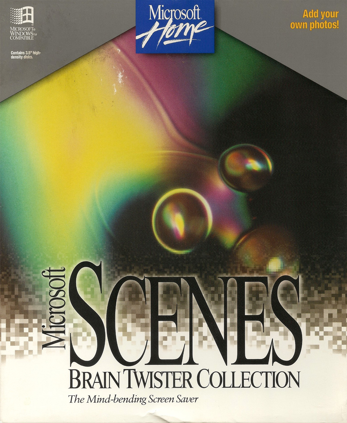
As part of the Microsoft Home line of software, the Scenes series of programs added a full range of customizable options for both screensavers and wallpapers. For a selection of flavors to choose from, there were a number of different subjects you can purchase such as the Undersea Collection, showcasing fish and plant life in the oceans; Hollywood Collection, which includes photos of famous celebrities and actors; and Sierra Club Collection of photos from the organization's archives. For this feature, the Brain Twister Collection was selected as the subject matter.
Of all the programs from Microsoft Home that we've explored thus far, this one has to be the absolutely most basic one of them all. In fact, it's more like an add-on function to the operating system as the interface is as vanilla Windows as you can get. After installing the software and launching it, you can see its interface is split in half down the middle where the screensaver options are on the left and the wallpaper options are on the right.
With wallpapers, you have around 40 images to pick from where all are filed under the category titled Brain Twister. For this series of images, Brain Twister deals with funky looking, somewhat abstract photos that may cause you to say "what the heck am I looking at?" For a better explanation, here's the official description written on the back of the box:
Using images drawn from the world around us, you'll be visually challenged by images as diverse as three-dimensional stereograms and other synthetic object to those from the natural world. Perspectives blast you 500 miles up into space or zoom you in microscopically close with magnification of 7000 power. It's as fascinating as it is fun to puzzle these pictures out.
Each image also has an option to have a small window display with the description of the image so you know what you're looking at.
For the screensaver, it basically incorporates all of the images used for wallpaper, but places them into a slideshow. Options allow you to set the duration time for each image and the kinds of transitions between each slide. Again, all simplistic and but very intuitive to use.
Probably the handiest tool of Microsoft Scenes is the ability to allow for the user to enter a password after the screensaver starts, which allows for a bit of security for the OS. If I'm remembering this correctly, adding a password or locking the OS didn't come standard to the OS until Windows 2000 or XP, leaving all 9X series of Windows vulnerable for unauthorized access.
For a personal touch, Scenes allows you to create your own collection of images for use as screensavers. The problem with this is pretty much one had a digital camera or a scanner for their computer back in 1994. So to make it easier for home users to get their precious family photos for use with Scenes, Microsoft created a division to digitize photos to digital pics that they mailed back to you -- just mail them your prints, negatives, or rolls of film and they will send a disc back. Of course, coming with a cost for the service, but it was a niche market, so they probably made some good coin on it until digital cameras began to rise in popularity.
By the way, if you made it this far on an article about how to use desktop wallpapers and screensavers for your PC, then you deserve a round of applause.
Sure, Microsoft is using Home to help children expand their knowledge with software found in the Reference and Exploration catalog with products like Encarta, Microsoft Dinosaurs, and Microsoft Dangerous Creatures, but let's be honest: while interesting as those applications may be, it's about as fun as walking through a museum. Where's the games!
As we saw in an earlier MS Home article, games are in the Entertainment catalog, but most are either remakes of arcade classics or flight simulators without much focus on kids being the primary players. With this in mind, Microsoft went about and created the Kids catalog that is robust in software for the pint-sized computer user with titles that include games with educational topics in mind or just plain old fun. Falling in line with the latter, this game is probably the oddest duck found in the kids section.
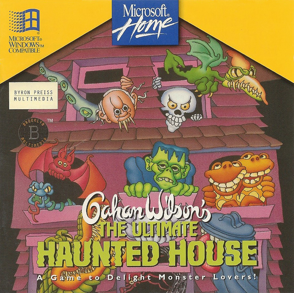
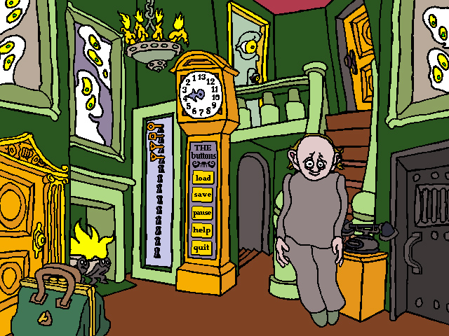
Gahan Wilson's The Ultimate Haunted House is an exploration game that has the player wonder around the inside of a haunted house. You're trapped inside and need to find 13 keys hidden throughout the house before the thirteenth hour is herd chiming from the antique clock in the foyer. If you don't find the keys in time, you're trapped in the house forever! *sounds of thunder*
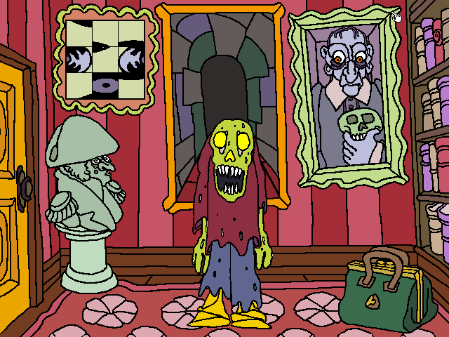
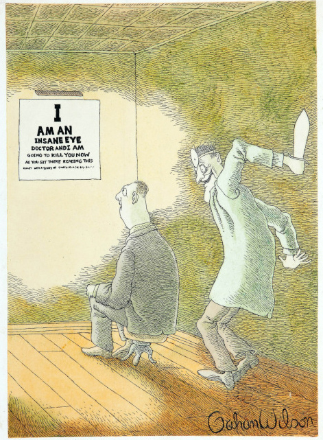
I find this game to be odd because of its art, which is done by Gahan Wilson, an artist known for his macabreillustrations that center around monsters and murderers. For this game, he toned down the spook level and designed monsters that were softer and kid friendly; otherwise I think kids may have been traumatized after playing the game. But Gahan didn't just provide the art, he came up with the idea for the game itself, so when I say this is an odd game, he'd probably take it as a complement.
In relation to the character art, the backgrounds are drawn in the same fashion: non-straight, hand drawn lines filled in with bright, vibrant colors. It's like playing a cartoon! Which I'm sure looked absolutely amazing back in 1994 when the game came out, and actually still does today because of the hand drawn style of it all. If anything, it has a real unique look that detaches itself from looking like most other games from the time that shared the same engine and thus had similar looking styles. Some examples include games from LucasArts which used the SCUMM engine or games from Sierra using the SCI engine.
Ultimate Haunted House is a point-and-click game minus all of the verbs at the bottom of the screen. Kids were kept in mind when designing this game as all of the menu options have been simplified to the max where Windows OS styled windows are kept to an minimum (mostly used for saving and loading games). If anything, you can relate it more to Myst in the way that there are no option windows to take the player out of the experience. The clock in the foyer acts like an options menu baked into the game itself with options like saving, loading, quitting the game, and accessing the help system.
As noted earlier, the goal of the game is to escape the mansion by collecting 13 keys hidden throughout the house. There's an overall timer, so you need to complete the game within a limited time or it's game over. 13 in-game hours is all you have, where in real life is about 20-25 minutes per in-game hour. The house has 13 rooms to cover, so this isn't the kind of game for they player to dally about. You need to start searching for keys immediately.
The most interesting thing about UHH is the randomness of it all. When you start a new game you need to select a difficulty level where the higher the difficulty, the more tasks you need to go through in order to find a key. For example, instead of giving a monster two items, you only need to give one. Rather than searching for and collecting a number of things and then combining them together to create a unique item, which in turn you give to a monster to receive a key, the already constructed item can be found without the need to scavenge for each thing and knowing what items you need to collect to construct it.
To help with that, there's a library with many books in it including cook books, formulas, spells, encyclopedias, and diaries. Even though they are written to be funny, reading all of the books is rather dull and sucks the fun out of the game; and I doubt many (if any) kids cared about that part. It kind of reminds me of the library in Myst where reading all of the partially burnt books on the shelf are time consuming and boring. But fortunately for Myst there is no time limit, so you can read all of the materials at a leisurely pace. UHH on the other hand has a time limit, and you get anxious when you are reading through the books because you hear the clock bell ringing from the foyer letting you know another hour has slipped by.
The monsters and where they show up are random. When they want something from you, it might be different from what they wanted from a previous playthrough, although they have personalities and will want or reject items to match who they are. For example the vampiress will reject a hand mirror while Frankenstein (Frankenstein's monster, whatever) will accept a brain. The game encourages the player to try items out on many things to see if it triggers an event. You might be hesitant to do that, but there is a place in the mansion to retrieve items, so don't fret over permanently losing an item while experimenting. Go nuts!
Other than the library, there's not much reading in UHH. Most is dialog spoken from the monsters and objects in the house. Each monster has quite a bit of dialog to match whatever you hand over to it. Once you complete the game you might have heard just a small fraction of all the dialog created for the game. Even the Help and Tips options are all told through spoken dialog. In addition, Gahan Wilson provides the voice for one of the monsters, a ghost with a good and an evil personality (also named Gahan).
If you're able to find all 13 keys within the time limit and escape the mansion, you literally get rewarded with items. Although not very exciting, they consist of media files that include audio drops in WAV format and comic art from Gary in the BMP format where you need to open and view it with something like MS Paint. Pretty weird that they give you this stuff outside of the game. For kids, it seems like it would have been more practical to have an option menu called Rewards within the game that allows the player to playback the sound files or display the images so you can view them whenever you want without having to use 3rd party or OS level programs. I don't know, maybe that was their sinister plan to have kids explore the operating system with the purpose of having them get familiar with Microsoft programs and the Windows platform.
When you look at the game as a whole, you can see it being like an interactive version of a children's story book. One of the more eerie ones with creepy looking illustrations where you pause and think to yourself "is this ok for a child to read?" Although it came out at a time before the ESRB, they did give a recommendation for players to be 8 years or older, which gives them some wiggle room with some of the content like seeing what appears to be blood spattered on some of the devices in the wreck room. And with content like that, this makes it the most interesting game in the Kids catalog of Microsoft Home. The kids love it!
Research. We've all needed to do research for school related projects and it required us going out and getting as much information on the subject as possible to then write a report for. Back in the day this mainly involved going to either the school or city library (or both) and then checking out books related to the subject. If needed, you can use an encyclopedia as a jumping off point to gather basic information on the subject and then using that intelligence gathering as a reference for the library to then select which books you need to check out. As an example, imagine you are in elementary school and you need to do a report on one of the planets in the solar system. First you would reference an encyclopedia to learn basic information about the solar system to find out what planets are in it with a summary of each one. Once you've selected a planet, you can then go to the library and checkout books related to the planet.
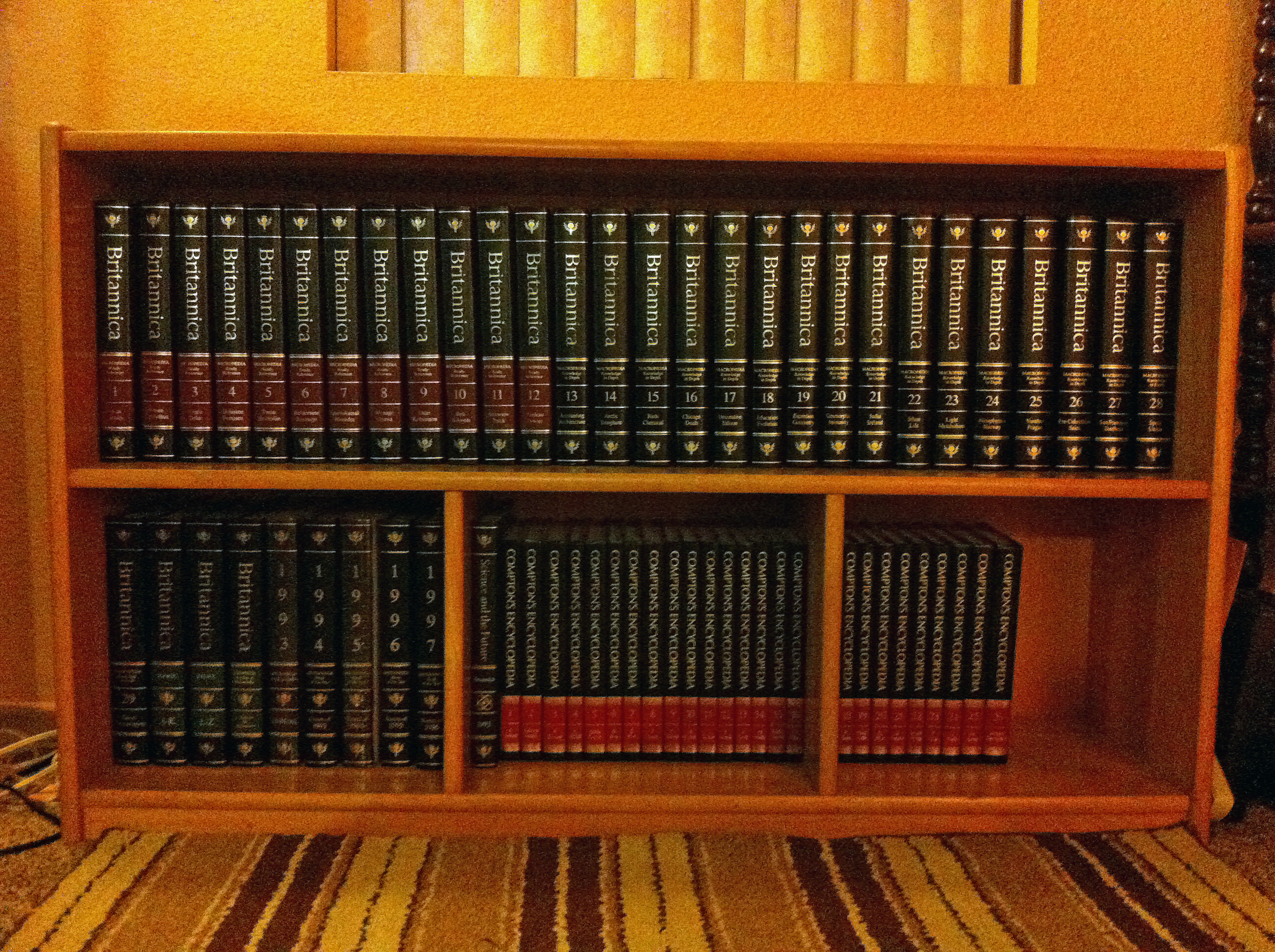
If you were really lucky (like me) you had an encyclopedia collection at home. In the 90s, the biggest name in home reference materials was Encyclopaedia Britannica, who had commercials running on mostly every children's television network or programming block, convincing parents that buying their set is the most important things to a child's education. My parents bought the whole set, and dedicated a huge chunk of the living room for the bookcase that would hold all of the books. With it we got the primary set, the "junior" set, the desk reference set (which was comprised of a dictionary, thesaurus, and book of quotes), and the yearbooks where the previous year was summarized into its own encyclopedia book. For us, we had years 1993 to 1997.
Microsoft, seeing an opportunity to add educational material to their library of software to be used on their operating system, decided to create a digital version of an encyclopedia collection, removing the need to have a large part of your real estate reserved for bookshelves. For small homes or apartments, this would be a huge selling point. So with this enters Microsoft Encarta, the digital answer to home reference materials.
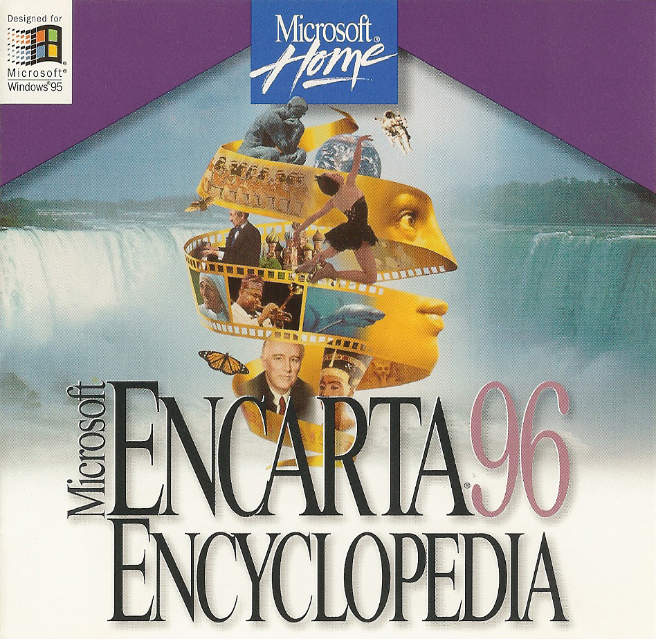
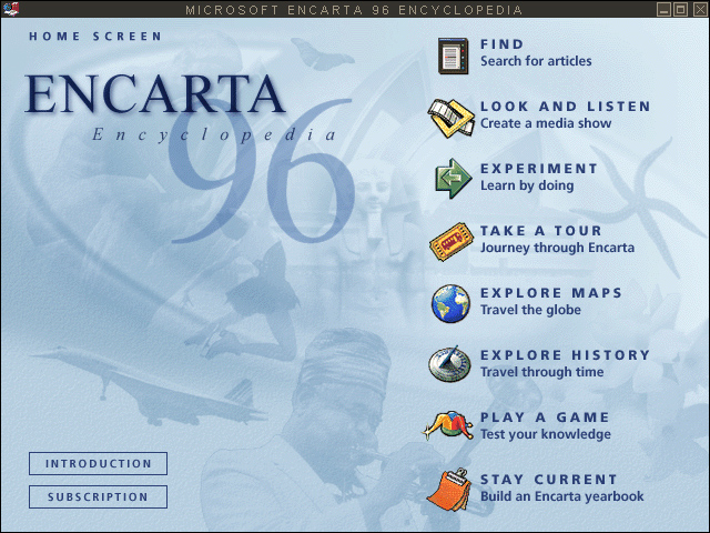
The first version was released in 1993, with annual updates for the product soon to follow. Sure, size was a positive as everything fit on to one disc, but the second advantage was having the materials come to life by means of interactive entertainment, thanks in part to the new media type: the CD-ROM. With it, you have the ability to include not only text and images, but sound and video clips, too. Other parts include the ability to click objects to start, stop, or loop and animated image, something along the lines of an interactive flash app. And encapsulating it all was an interface that mimicked how navigating worked to the World Wide Web with concepts like pages and hyperlinks. Progress kept building for a few years until we had Microsoft Encarta '96, which is what we'll be looking at today. Why this specific one, you ask? It's the one I used back in the day. That's why!
The first major facelift for Encarta happened a year earlier with Encarta '95 when most of the buttons now have their own unique look, to where everything now fits the theme of an executive looking application which comprises of a creamy, tannish colored background for the content which sits on top of a black backdrop. Gone now are the default looking grey buttons found in Windows related products, giving the software a more professional look. Minor changes were made to the interface between '95 and '96, mainly focused on the menu strip located at the top of the window, which was fine as the previous theme fits well for a research program.
Navigation begins at the main menu where the user can search for articles in a number of ways. The default option would be to use the Find menu where a list of every article is displayed in alphabetical order. Typing in your subject in the above text box will change the focus of the list to your search criteria. If you want to work backwards and just search media like images, video, and sound clips, then the Look and Listen menu item is what you want. Encarta also includes a world map where you can click on a region to zoom in on it so it'll list things such as cities, seas, mountains, and other major points of interest. Some would even allow you to click on a name of a city or mountain to take you to the article.
Exploring articles through different ways of categorizations help to discover new subjects. For example, Guided Tours ropes entries together into categories and then submenus called "tours" where related articles are queued up in order and are called "stops" that are along the tour. One category is called Role Models and its submenu has a number of tours like Young Achievers, Olympic Medalists, and Visionary Thinkers. If you were to select the tour called Young Achievers, articles from Alexander the Great, John Kennedy, and Shaquille O'Neal would come up as stops.
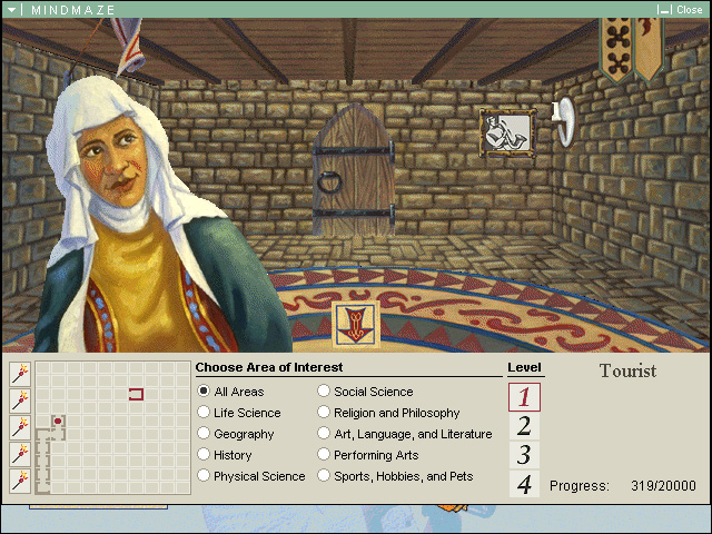
The main menu includes an item called Experiment that includes interactive animations that tie closely to articles scattered throughout Encarta. One includes learning how orbits work while another is a game on natural wonders where you're shown an image of a natural wonder and you have to click on the world map where it's located. Even though these are games of sorts, they don't compare to the juggernaut of a game that is included in Encarta called MindMaze, where you run through a medieval castle, room by room, and answering trivia questions along the way to progress forward.
While it would have looked cool if they made MindMaze a 3D game with something like the Doom engine (or the engine used for Hover!, for that matter) they instead opted for a 2D slideshow styled look where each room is a single image that they recycle over and over again. The characters who ask you trivia questions are static profile images with no animation to them, making the experience of crawling through the game rather dull. The gameplay aspect comes from answering multiple choice questions with a timer – the longer it takes to answer a question, the less points you'll receive. You advance to the next level by earning enough points or getting to a certain room in the castle. For a personal note, I can't believe I played this game so much when we just got our family computer. I guess I just wanted to see what the ending was going to be. A final boss? A door leading to the outside? A time warp where you're cursed to playing this game forever?! Unfortunately, I never finished the quest to find out.
The tie in for MindMaze to the encyclopedia part of Encarta was the ability to read the articles from the multiple choice answers. Each article's page included links to other articles related to the current one. In addition, most pages included images where if you clicked it would bring up a larger image and a caption provided at the bottom of it. Sound files and video files used the same media player that looks similar to an early version of Microsoft Media Player. It's simplistic, but gets the job done.
Microsoft would continue this trend by releasing annual editions of Encarta until the year 2000 when they began to split between physical distribution and online access to an Encarta website which needed a subscription to get full access to. At this point, the Encarta product began to lose it stability as online content began to take over as a primary source of information, mainly due to the fact that it was free and easy to access from any platform (not just Windows).
Encarta would eventually be handed over to another company who would continue managing the product by adding articles and updating older ones, but by 2009, Encarta became as obsolete as their former physical competitor, Encyclopaedia Britannica, and fell to the wayside, ending both the CD/DVD version and the Encarta website. Today, Wikipedia is the go-to de facto standard when it comes to encyclopedia standard content; and possibly even more so since some articles can be pages worth of content as opposed to just a short summary located at the corner of a page with the physical version.
You don’t really see retro compilations anymore due to the current era of online gaming markets. Why bother putting out a package of old games when you can release just one retro game and charge a higher price for it? Nostalgia for older games is now bigger than ever and game companies know this, so they stick it to us consumers by making us buy each game from the, say, Resident Evil series one at a time rather than one bundle brimming with content. Sure, this is the norm now, but it was a completely different story ten plus years ago when we were buried in classic compilations.
It seems like the idea of bundling older games together mainly got its start during the early days of the CD-ROM being used for gaming. This may have stemmed from the fact that storage space was no longer a concern when compared to cartridges where you needed to add more memory chips if more space was required. Either that or the idea of retro gaming began in the early '90s. In either case, using cartages wasn’t completely out of the question, or say a floppy disk in Microsoft’s case.
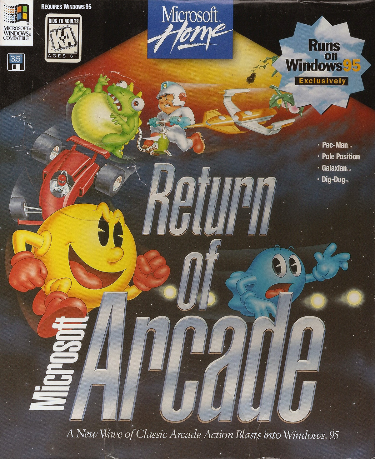
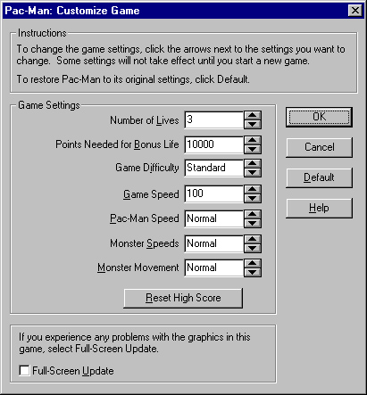
Yep, Microsoft also got into the business of repackaging old games together for modern platforms, and for them it was for their latest operating system, Windows 3.1. Released in 1993, Microsoft Arcade gets you a 5 in 1 set from Atari’s archive of arcade classics. With it comes: Asteroids, Battlezone, Centipede, Missile Command, and Tempest. They would do this again in 1996 with a follow-up called Microsoft Return of Arcade, but this time with games coming from Namco.
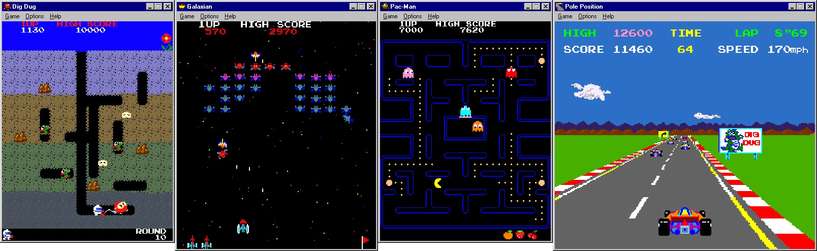
For reasons unknown, they were still using floppies for Return of Arcade for Windows 95 in 1996. By this time you’d think they would have completely moved over to CDs. So instead, spread across three 1.44MB floppies you get four of Namco’s arcade games: Dig Dug, Galaxian, Pac-Man, and Pole Position. The odd thing about these games from Microsoft, though, is that they are not within a game itself. Rather than launching a game and then selecting one of the retro games from a menu, they are accessed from the Start menu itself. My guess would be they wanted these to be "desktop" type games to keep you in Windows without the need to leave the taskbar and filesystem interface behind. Probably so you can easily play while working at your cubicle ;-)
These ports look and sound very similar to their arcade counterparts, but they are not emulated versions of the arcade originals. Microsoft built these games with their own development team to have them run on their OS. It may be hard to notice at first, but eventually you’ll see subtle differences like instructions telling the player to "Press F2 to play" found in Pac-Man or where the attract screen for Galaxian does not have the number of credits displayed at the bottom-left corner of the screen.
Minor differences like those aside, these are practically arcade perfect ports; much better when compared to compilations found on the Sega Genesis or Super Nintendo. For starters, they keep the screen orientations the same as the arcade so nothing is squished or stretched. Take Pac-Man and Galaxian for example with their vertical screens. Since these games are running in a window inside of a computer rather than on a traditional 4:3 television screen, this can easily be accomplished. Sure you can change it so the game is full screen, but vertical bars will fill both sides of the monitor with a patterned "Return of Arcade" logo plastered across them. But when it comes to Pole Position you get a boxed 4:3 window that is similar to its arcade version.
With these games having simple controls, the keyboard is a great substitute for the joystick and button. All five of them use the arrow keys for moving your character while using the spacebar for attacks. For Pole Position the mouse can be used as a secondary control scheme by moving the mouse left and right for steering, shift gears by clicking the right mouse button, and accelerate with the left mouse button. This is the preferred way as turning can be applied gradually instead of it being a binary command of either turning or not turning with the arrow keys.
Alternatively there’s the option of changing what keys on the keyboard to play with, allowing for some customization. But if the keyboard is not your fancy, then plug in your favorite joystick into the computer and you’re good to go. However, since ROA came out in 1996 you may need to use a joystick with a serial connection along with the drivers for it. No plug-and-play USB voodoo magic here!
What’s really cool is them mimicking the DIP switch settings found in the arcade versions. In case you don’t know, DIP switches are chips with tiny physical switches on them that are soldered onto circuit boards, allowing the operator to make minor changes in how the software works. For arcade games, you can have a switch determine how many lives a player can have per play, say 3 or 5 for example, or how many points are needed for a 1up. It’s little things like these that make Return of Arcade so awesome.
Acting as the sprinkles to this compilation sundae are the inclusion of short write-ups for each of the games. In the Help menu there is a selection labeled "History of the Game" which is broken down into a few sections where they interviewed the Director from the National Video Game and Coin-Op Museum in St. Louis about the title in question. In addition, Namco throws a little fun fact about their products, describing what occurred around the time the game was in development. If you want to read these write-ups, I’ll include links to them at the bottom of this post.
The better version of ROA came out a few years later in 2000 when they included Ms. Pac-Man to celebrate the 20th anniversary of Pac-Man, bringing the number of games in the package to five. Thankfully this version was on CD instead of floppies and contains a menu to select games from. Ms. Pac-Man looks to be the only one in the batch to be running on an emulator, but the rest play the same as in the 1996 version.
Return of Arcade brought a little more fun to the Windows desktop, adding alternatives to other quick play games like Minesweeper, Solitaire, or SkiFree. And as a tip: pressing the [Esc] key on the keyboard will pause the game and minimize the window to the taskbar. You know, just in case your boss happens to be passing by your desk!
For the average Joe, needing a reason to own a computer in the early 1990s was still a hard sell to come by. Why spend thousands of dollars on an overpriced calculator that envelopes itself on your desk with all its cables and peripherals? Why spend all of that money for typing out documents when a typewriter costs much less and its output practically the same? Why use a spreadsheet program to calculate my personal finances when a checkbook will suffice? It wouldn’t be until the latter half of the ‘90s for the World Wide Web to explode in popularity to be the reason to finally entice consumers to purchase a computer so they can use it as a sort of car to travel on the information superhighway.
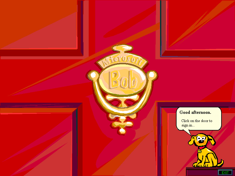
But once average Joe did purchase and bring home a computer, Internet aside, would they actually use it? Would it be too intimidating from the viewpoint of a user interface? Computers in the early ‘90s may have been intuitive to use for people in their mid-twenties and younger, but for everyone else who got through life just fine without a PC, it may have been some sort of alien technology. So to tap into that twenties and above demographic that may be indifferent to menu systems, Microsoft came up with a program that would, hopefully, ease users into working with a modern file-system interface. The result: Microsoft Bob.
Released in 1995, Bob would do away with things like the taskbar, windows, and menu systems and instead replace them all with something every sane human should be able to comprehend: reality. For starters, when logging into Bob (which can be setup to be used as the interface to log into the Windows OS), instead of seeing the traditional Windows 95 login window that includes a textbox for a username and a password, Bob’s interface shows a front door with a door knocker. When you click on the knocker, it will have you choose between a number of names (which is a list of Windows user accounts on that computer) and then will ask for the password. If successful, it's like the equivalent to unlocking the front door with a key so you can enter your home. Hey, just like in real life!
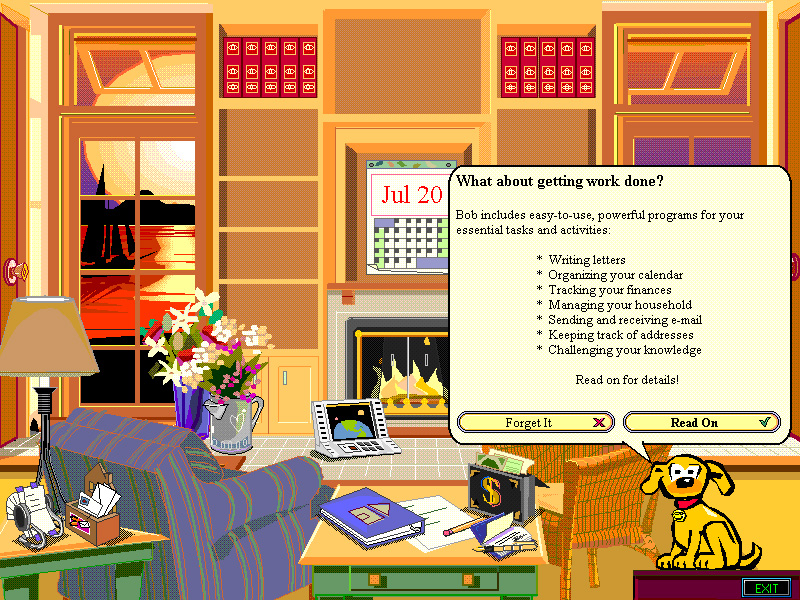
Once inside, instead of seeing the traditional Windows desktop and taskbar, you are greeted with a room. Yep, the primary interface of Microsoft Bob resembles that of the inside of a house. These rooms are flat 2D images instead of polygonal 3D. Each room is stocked with objects which you can add, delete, move, and resize to fit the needs of the room. Some objects are functional while others are just for decorating your rad pad.
The first room you enter should be the Public Family Room. Like folders, you can assign rooms to be public (where other Bob users can visit) or private (for your eyes only). Rooms can be added and deleted from your home and can be different types like the kitchen, study, and garage. There’s nothing unique about the types of rooms because any object can be placed in any room type, so having different rooms are just for visual appeal.
Customization is probably the biggest advantage that MS Bob has because you can go nuts with decorating your rooms. By default, when you use Bob for the first time it gives you a house with a contemporary style. But if it looks too homely for your taste, you have the option to change the style to look like a medieval castle, or a hip and trendy postmodern condo, or a good ‘ol retro style house (which reminds me of what home décor of the 1950s/60s looked like). Best thing of all is that the options you make aren’t permeant. If you picked the castle but changed your mind and want to go with a retro look, then with a few clicks *poof*, your home is a blast from the past suburban home.
Objects act the same way as room styles, too. When you add a new room, default objects are also thrown in to make it look like the room has already been lived in. A clock could be on the wall (which displays the computer’s current time), a calendar showing today’s date, a paper and pencil on the desk for the word processor, or a box of letters on an end table for the e-mail client can been seen peppered throughout the living space. For decorative objects, you can pick from a wide variety and place them anywhere you want in a room. The art design for objects look pretty much like clip art you’d see in Microsoft Works word processor during that time. Objects ranged from books, boxes, cars, lamps, chairs, tables, toys, kitchenware, and plants. Fire types could be selected too and were animated to show the flames licking within the fireplace (or anywhere since the flame objects are not constrained to just the fireplace).
Same thing goes for functional objects. Bob comes preloaded with a few programs to assist with daily tasks. For one, it comes with a word processor called Bob Letter Writer. The interface for it has been simplified to where it doesn’t have the standards like a menu or tool bar. Instead it’s a pencil with buttons placed on it that do basic things like bold, italicize, and underline; cut, copy, and paste; and align text. The button on the eraser is the equivalent of pressing the delete key on the keyboard. Next to the pencil are buttons for actions like printing or zooming in/out of the document. Other Bob programs include a program to balance a checkbook, an address book, a house manager, and a financial guide.
Probably one of the more useful features is to add non-Bob programs to a room. You can have it scan for programs in the Program Files folder and have them listed just below the ones that come with Bob. Unfortunately the objects are just boxes with a default icon on them. It would have been cool if they had the icon of the program blazoned on the box, but I guess even a high customization program like MS Bob has its limitations.
When in your home, take note that you’re never alone. Someone is always stalking you, watching your every move as you go from room to room. But don’t be scared as they are there to help you out with anything you may need. A personal guide is always in the bottom-right corner of the screen and asks questions in word bubbles that appear above it. By default Rover, the playful dog with yellow fur, is your companion, but you can pick from a number of guides where every one of them has a status page that include detailed information like their hobbies, birthdates, and hometowns. What a crazy thing to have! All of them have a number of animations and speech dialog to match their personalities.
Their heart was in the right place but Microsoft Bob was not a product consumers wanted. Given the time of its release, either you were comfortable with navigating the interface of Windows or you just dealt with it. Unless it was the default interface for the operating system, no one was going to use it as intended. When I had Bob back in 1996, I just used it as a sort of doll house to design my vision of what my own place would look like. I never actually used it as an alternative way of working with Windows. For me it was just a toy to mess around with for about 20 minutes.
But from the ashes of Bob came a number of elements taken from it that spread across programs coming from Microsoft and stuck around for the next decade. The biggest are the personal guides that assisted you through MS Bob. Mainly seen in Microsoft Office products such as Word and Excel -- which includes the famously known guide as the paper clip who everyone loved to hate -- Clippy would be the most memorable thing to come of the office assistance feature. The office guides would be streamlined by placing them into Microsoft Agent, a piece of software that would be compatible with Microsoft applications as far as being included with Windows Vista and supported up to Windows 7. Related to the guides, Rover would be seen in Windows XP’s search window.
So seen as a failure and ending with a wet thud, MS Bob was quickly put to pasture and was never given a second chance for revival. Most tech sites today label MS Bob as a dismal failure when it comes to software, but at the same time it seems to have high a curiosity factor as people find copies of it and post videos of it online and write about it from time to time. In fact, you’re reading one right now!
I have no idea why, but I’ve always had an odd fascination for productivity software that came out during the Windows 95 era. More specifically, software from Microsoft itself with its own line of software applications under the Microsoft Home title.
Since I currently have a running copy of Windows 95, I decided it was the right time to take a look back and check out the Home suite of software to see how some of them were like. So with this decision in mind, I made a wish list of programs I wanted to try out and then went over to eBay and buy them. Fortunately everything on my list was listed at reasonable prices to where I could pull the trigger and get this now seriously outdated software. Seriously, some of the content is worth a few chuckles due to how out of date some of the materials are.
But since I lived and used software like it at the time, I can put myself back into that frame of mind and give what I feel is a good evaluation of how good or bad the software is. To get an evenly spread out observation of what software was available, I decided to get a copy of a program from each of the five Microsoft Home categories which are: Home Productivity software, Entertainment, Reference and Exploration software, Kids, and Sights, Sounds, and Gear. To easily distinguish between each category, they were given colored banners for their boxes and promotional material. Home Productivity has a green banner, Entertainment has a black banner, Reference and Exploration software has purple, Kids has yellow, and Sights, Sounds, and Gear owns grey.
This exploration of MS Home will be a mini series of blog postings spread across several weeks to hopefully act as a bridge between the remaining gaming journal entries I currently have to another new feature I hope to unveil sometime soon. But in the meantime, get ready to go back to the 1990s when Seinfeld was must see TV, Beavis and Butt-head were scaring conservative Christians, and when Microsoft (M$) made the move to place a computer in every home by not only making an operating system, but software that runs exclusively with it.
Wait a minute, this blog already yaks on about the ‘90s on a constant basis as is, so I guess it’s just business as usual? ¯\_(ツ)_/¯

 Starting with Windows 95, there was full functionality built into the OS for things like custom wallpaper for the desktop and screensavers when the PC was in idle use. Sure, you could have had patterned wallpaper and a screensaver for Windows 3.1, but they were features that were lacking in options and not fully fleshed out until 95 rolled out when it began to feel complete; so much so that the windows form for these features looked nearly the same for many versions of the Windows OS following 95.
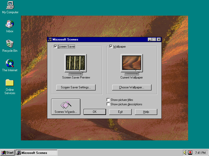


 I have no idea why, but I’ve always had an odd fascination for productivity software that came out during the Windows 95 era. More specifically, software from Microsoft itself with its own line of software applications under the Microsoft Home title.